Thursday, 21 March 2013

Evaluation question 7 - Looking back at your preliminary task, what do you feel you have learnt in the progression from it to the full product?

Looking back at our preliminary task it is clear we have progressed a lot, we had several issues when filming and editing our preliminary task, which we have learnt from, which is evident in our final film opening.


When we filmed our preliminary task we found we didn't have enough footage to make editing for continuity effective enough. This is something that we avoided in filming our actual video as we filmed each shot at least three times, by doing this we had enough footage to ensure continuity was accurate. We also made sure we planned several filming days, allowing us to shoot enough footage, as shown in our filming schedule.

Another problem which we have worked on since the preliminary exercise is creating effective continuity. Through thorough and detailed planning using a storyboard and our editing knowledge we were able to improve on these issues for our final video. We also produced a rough first cut video which allowed us to ensure the continuity of the shots was accurate and overall effective.

When filming our preliminary exercise we filmed with the members of our group acting within the video, although this was effective enough for that task, it made us realize the importance of using a good actor to create the appropriate effect in our final piece. We chose Emily Gow who is an A Level Theatre Studies student and acts outside of school, this meant that she was able to fulfill the role of our main character appropriately to create the correct atmosphere.


Our understanding of mise-en-scene has developed throughout the process from the preliminary task to the full product, this means that we had a better understanding of the different aspects which make up an effective film opening and create the mood required. To ensure this was shown in our opening we specifically chose certain items to be placed around the set, each of these separate props built up and added to different aspects of the narrative.


We picked a dead plant to represent the idea subtly to the audience that the house has been empty for a long time. We used a lot of aspects of mise-en-scene that were very subtle and did not draw a lot of attention to them so that they present the idea to the audience without being to obvious.


We also paid attention to the small details of the mise-en-scene to make our piece look more realistic as the photograph of the house has a post-it note attached with the address on. Although these are only small details that will not be a large focus of the audience's attention, by adding these factors we have made the mise-en-scene effectively suit our narrative.


Melissa Hudson and Chloe Barker

Wednesday, 20 March 2013

Evaluation question 6 - What have you learnt about technologies from the process of constructing this product?

In the making of our opening sequence we have used many different pieces of equipment and technology, whether it be online or something concrete. This is so we are able to achieve our aims for the outlook of our media product and increase the quality of it.


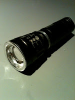
For the inside of the house we wanted the lighting to be very low-key to help show to the audience that the family was no longer living there. To achieve this we used a small white light torch, as we wanted the lighting to look cold and grey as opposed to the warm lighting from the street lamps outside, and a light diffuser to prevent the torch from creating a spotlight. However, after our first edit we found some of the shots we took were too dark, and when we went back to re-film these shots we found we could brighten the torch, which worked to our benefit as it improved the quality of the camera shot and the clarity of the picture, making the opening sequence better as a whole.


Cold/Grey Lighting

Warm Lighting


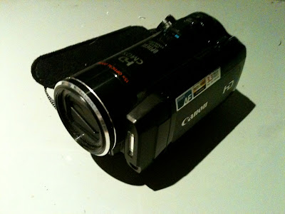
To film our media product we used a Canon HD video camera, and although this struggled in low light it obtained an overall good quality picture. With this camera we were able to manually focus as well as change the lighting if necessary to adjust to the darkness or to make the lighting warmer, as well as change the exposure of the camera and record a clear sound by increasing the microphone, which was located at the front of the camera. We placed our camera on a Tripod in order to make sure our shots were steady and to achieve smooth pans and tilts, although we found when doing over the shoulder shots this was difficult due to the limited height of the Tripod and so we had to result in doing handheld over the shoulder shots instead, although we managed to keep the camera fairly steady and so this did not make much difference.


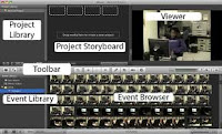
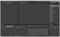
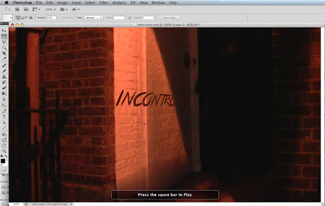
To edit our opening sequence we used both iMovie and After Effects, as whilst we found iMovie was good for the simple editing cuts and to add sound and credits, After Effects was needed for more complex editing, such as having the title 'Incontro' appear on the   wall as the character walks past. For this we first used Adobe Photoshop to create the text of the title on a still frame of the desired shot, taken with Grab and taking the still frame from iMovie, using the font 'True Lies' from dafont.com and chose the colour, before copying this frame into After Effects. In photoshop we had to get the text at the right angle so it looked like it was on the wall, which we were able to do by using the Text tool. To obtain the colour we wanted we used the Eyedropper tool, which allowed us to match the colour of the text to the colour of the bricks by clicking on the bricks and then the swatch at the bottom of the toolbar, which meant that the colour fitted with the scheme in the rest of the frame. After this we hid the still frame we had taken from the movie so we could save the text online without any background as a png.

We then imported the movie file of our opening sequence we edited in iMovie to Adobe After Effects before importing the .png file of the text and then layering this overing the top of the movie file on the correct frame where we wanted it to appear. We then created a Travelling Mask, which we could move flexibly using points of the Mask to match the shape of the actress at each frame as, meaning the text would appear as she walked past.


iMac we used


http://freesound.org/
 

For our sound, as well as using the microphone on the camera to record the actual events as they were being filmed and the voiceover we also used sound effects from a royalty free sound effects website called freesound.org. From this we were able to get sound that would be non-diegetic in our opening sequence, such as the violin effects, as well as sounds that the camera may have not picked up, such as the knock on the door, or the woman breathing.

Kira Welland

Tuesday, 19 March 2013

Evaluation question 5 - How did you attract/address your audience?

The character we created was an everyday person with a good job, many people can relate to this and the fact that she's a woman makes her seem more vulnerable and instantly attracts the female audience. Through the first ten seconds of the opening, the audience can understand the genre through the voice-over describing her assignment, the scene, the low key lighting and loud sound effects with no music to add the suspense.


 The setting of a high street which we used.


The street which the protagonist is walking down is clearly a normal town from the constant cars going past and street lights. The cars may leave the audience feeling slightly more secure as you know she isn't alone, but that just adds greater suspense when she later is.


The low lighting, shadows and dark costume.


The sound effects were deliberately loud and by no music being used, they appeared more effective and created jumps for the audience by the unexpected sounds. The shadows used are fast moving to scare the audience immediately as opposed to lingering images which alarm the audience differently.

The audience is informed through the voice-over which is a man's voice describing what the protagonist's role is and what should happen, again shocking to the audience when what they expect to happen doesn't.

In terms of promotion of the film, we do not have a big budget, and so the best way to attract our audience would be by creating a buzz about the film, through fast, action trailers and interesting posters that show off our movie (such as the one we've made). We could also use word of mouth, encouraging people to get excited about the film so that they tell others, as well as using the internet. Social networking sites such as Twitter and Facebook would be perfect for promoting the movie, not only by people talking to each other but also by creating fan pages for the movie, such as the recent 'Spring Breakers' movie has done, tweeting and creating status' about the events happening around the movie and everything to do with it, such as trailers, promotional mall tours and release dates. Youtube would also be very good to promote our film, which we have uploaded our Opening Sequence to, and we could also upload promotional trailers and teasers.


Laura Witt

Monday, 18 March 2013

Evaluation question 4 - Who would be the audience for your media product?

After doing some target audience research both online and by doing questionnaires we found young adults would be the most likely audience for our media product. This is because the genre of our movie is a crime-thriller, meaning it will not only be fast paced but could also be scary and jumpy.


From our BBFC rating research we found that thrillers are either rated 15 or 18. For example, Se7en and Pulp Fiction were both rated 18, and so our audience would most likely be 18 or above, although our genre may not appeal to everyone that age due to personal choice and favouritism of genre. Apart from the BBFC ratings there is not much limit to the age of our audience, which is important as we would need to attract as many people as possible to make our movie a success. From our research we found that thriller is one of the most popular movie genres and so our film is likely to have a wide audience.


Although stereotypically some people may think boys are more likely to watch crime-thrillers our media product will also appeal to girls as our main character is female, helping to also attract a female audience, although our film does not specifically appeal to one gender, meaning we can attract a wider audience to help make our film a success.


Kira Welland

Sunday, 17 March 2013

Evaluation question 3 - What kind of media institution might distribute your media product and why?

After researching movies similar to our opening sequence we found Lionsgate would be an appropriate company to distribute our film. This is because of the similarity between genre and conventions in many of the movies they produce.


For example, both 'House at the end of the Street' and 'The Cabin in the Woods' use similar low-key yet warm lighting as well as having similar secretive and mysterious themes. We have also used a similar setting to 'House at the end of the Street' as the main action is based in a house.


Lionsgate have also released a crime thriller called 'The Next Three Days', therefore making Lionsgate a suitable choice of distributor, as they have been involved in the distribution of a film of the same genre to our own film, 'Incontro'.


However, due to the low budget of our film we used unknown actors and directors, a local setting and limited special effects. This caused us to suggest that our film may be better suited to being distributed by a smaller independent distribution company, such as Film 4, who are a subsidiary of Channel 4. Film 4 are well known for distributing less well known films and especially British films.

Kira Welland, Chloe Barker, Melissa Hudson and Laura Witt

Saturday, 16 March 2013

Evaluation question 2 - How does your media product represent particular social groups?

The two main categories for social groups that are represented in our film opening are the social groups of gender and age which split into sub categories.

Gender

Male

Female


Age


Old

Young


Chloe Barker

Friday, 15 March 2013

Evaluation question 1 - In what ways does your media product use, develop or challenge forms and conventions of real media products?

Looking back at our research on codes and conventions of film openings and of the genres; thriller and crime, we have put together this mind map to show all the conventions considered in our research and how we have used/ developed/ challenged these in our own film opening. The highlighted conventions are the ones that we have used.


Looking at the conventions of a film opening we have used all of these apart from the introduction of a protagonist. We challenged this convention in our opening sequence as it is not made clear whether or not the entire plot follows the character shown in our opening sequence, or what happens to her at the end of this opening. This creates more interest for the audience as it is not clear what happens to her, creating mystery.

The detective in our opening sequence meets the conventions of a detective in a crime film as she wears a trench coat, heels and is formal and independent. We chose to use these conventions as the heels made an effective sound along the pavement in the outside scene, therefore adding to tension and creating a strong use of sound. 


By having her in a trench coat, combined with the non diegetic voiceover at the beginning of the sequence, we were able to make it clear what was happening within the plot. Having an independent female detective makes her seem more of a vulnerable character and also makes her more relatable for the audience. Our actress wears subtle red makeup, which emphasizes and foreshadows the idea of danger which meets the conventions of a crime film.


We used the convention of having a villain in dark clothing, which fits in with the both the genre of thriller and crime, this meant that the audience would want to continue watching the film to find out what was actually in the house and why. We also developed this convention by only having visible silhouettes of the 'thing' and the hand at the end which was in a glove, therefore making the mystery more intense.

Inkeeping with the setting conventions for a typical thriller film we chose to locate our opening sequence in an abandoned house in the evening. The time of day was important as the darkness, accompanied with our low key lighting, created shadows, and distorted the audiences vision, putting them on edge as one of their senses has been impaired. We used the abandoned house to increase the sense of danger for the audience as it increased the idea of isolation and vulnerability.

Melissa Hudson